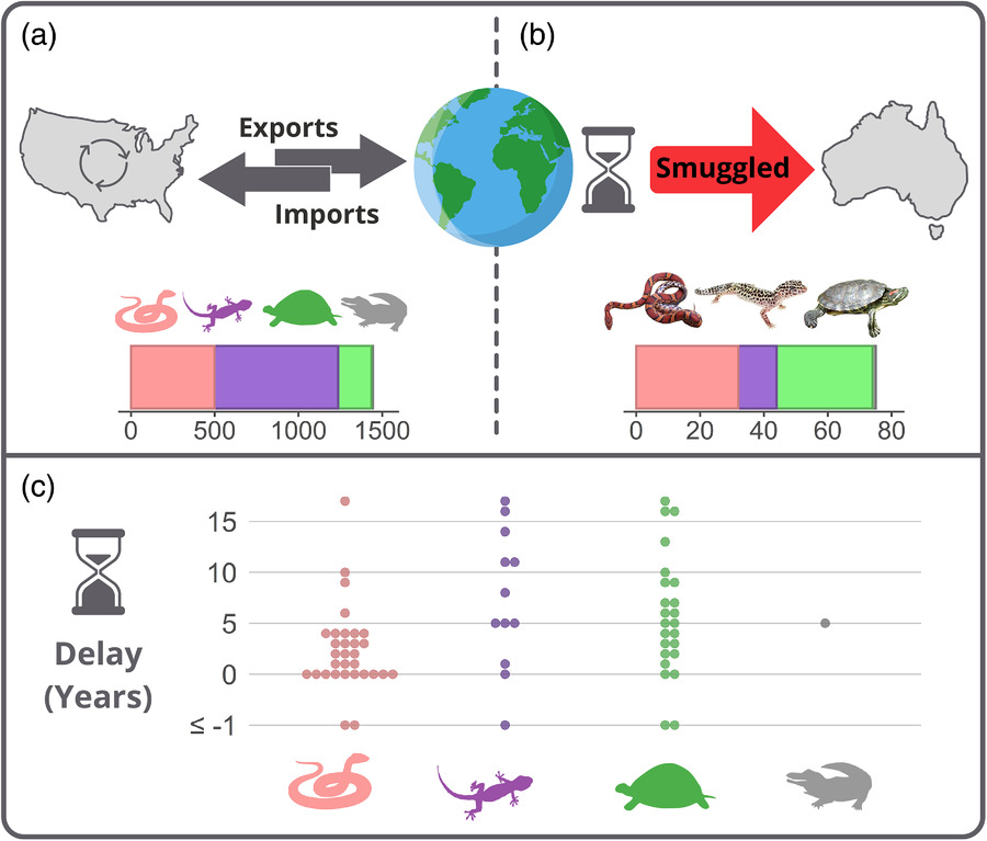
Trade and Smuggling of Reptiles: A Global Perspective. This diagram provides a comprehensive visualization of reptile trade and smuggling dynamics between the U.S. and other global regions, with a particular focus on smuggling routes into Australia.
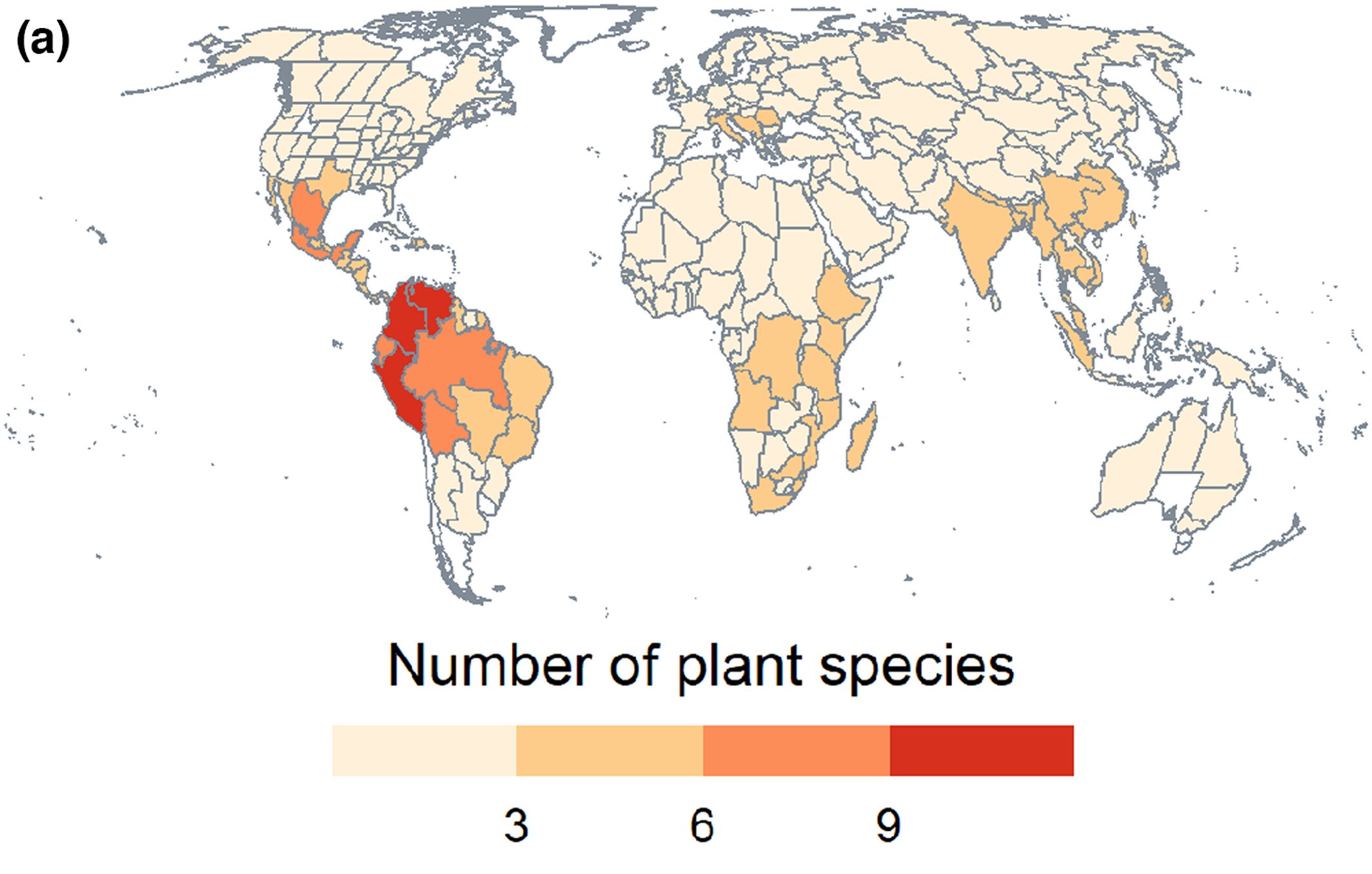
Global Distribution of Plant Species Traded on the Dark Web. This world map visualization presents the native distribution of plant species involved in dark web trade.
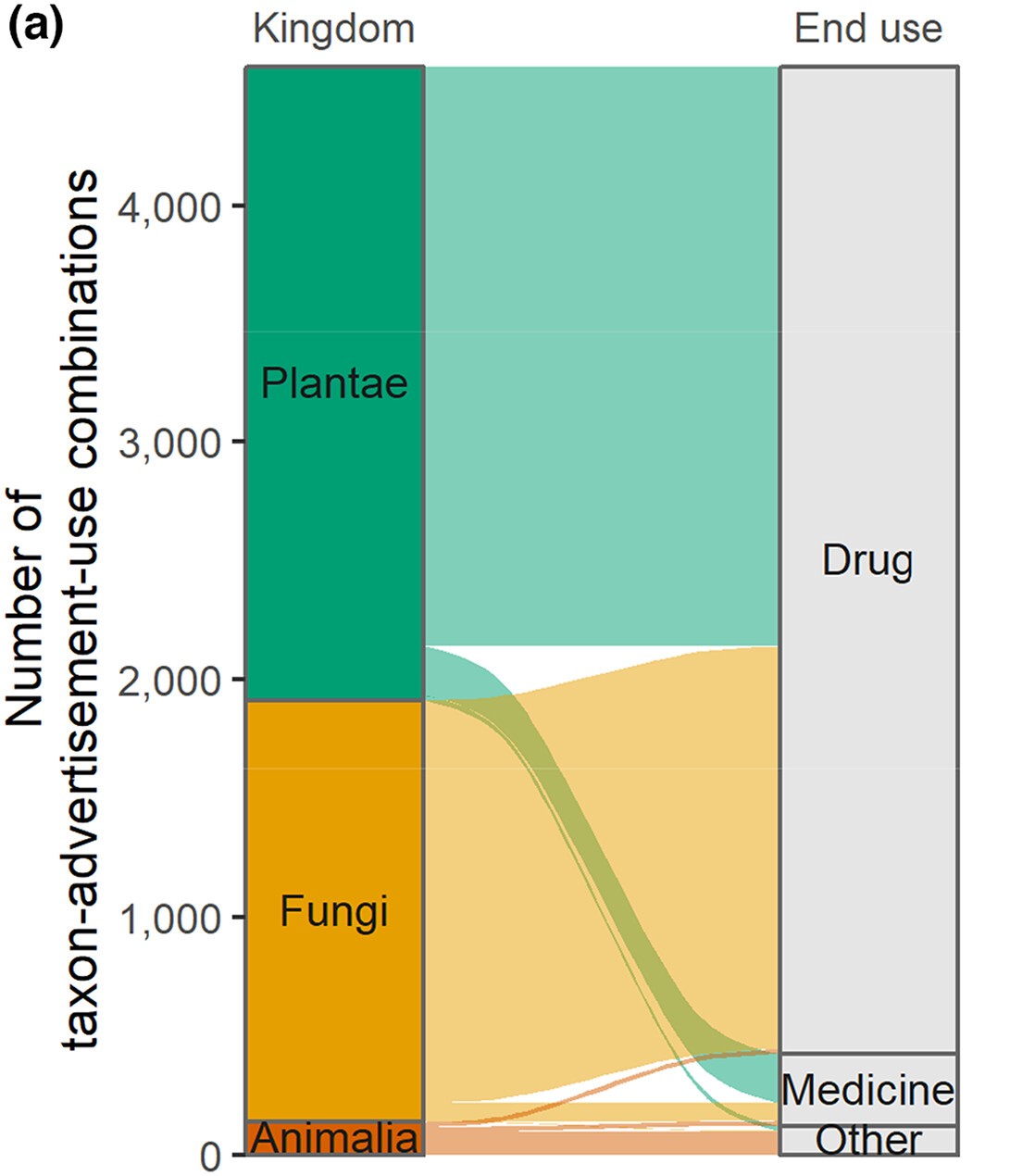
End Use of Wildlife Traded on the Dark Web. This Sankey diagram illustrates the flow of species-use combinations across three kingdoms (Plantae, Fungi, and Animalia) to their associated end uses (Drug, Medicine, Other).
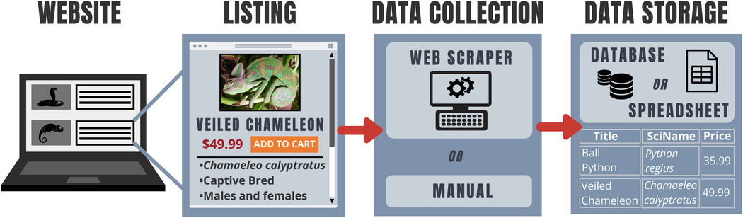
Data Collection and Storage Workflow for Online Wildlife Trade Monitoring. This infographic illustrates the end-to-end process of collecting and storing data from websites trading wildlife. This diagram demonstrates process-driven visualizations that simplify complex workflows for research audiences.
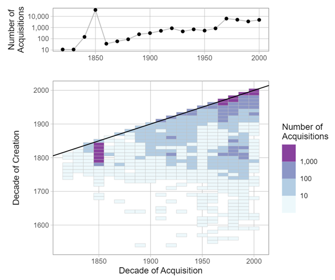
Tate Art Museum Acquisitions by Decade. This visualization tracks the Tate Art Museum's acquisition history, showing the number of artworks acquired by decade (top) and the relationship between the decade of creation and the decade of acquisition (bottom). This interactive graphic allows for dynamic exploration of the data (view interactive plot
here).
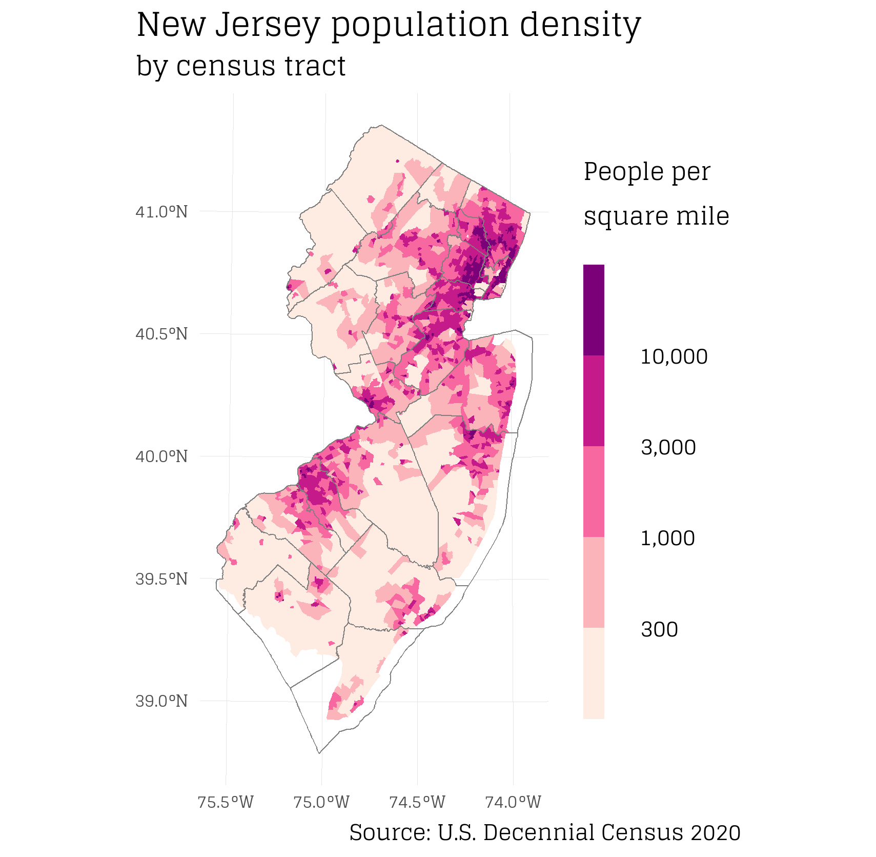
New Jersey Population Density by Census Tract. This choropleth map visualizes population density across New Jersey, measured by people per square mile, according to the 2020 U.S. Decennial Census. The color gradient clearly delineates high-density areas, with darker shades representing more populous regions.
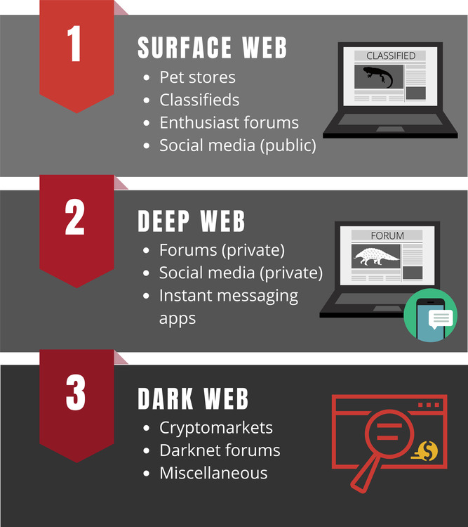
The Three Layers of Wildlife Trade on the Internet. This diagram categorizes the different levels of the internet where wildlife trade occurs. Each section highlights the types of platforms used for trading, from public pet stores and classifieds to cryptomarkets and private forums.
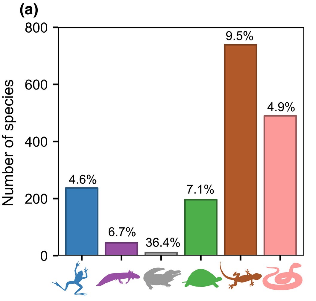
Species for Sale in the U.S. Exotic Pet Market by Taxonomic Group. This bar chart illustrates the number of species for sale in the U.S. exotic pet market, categorized by taxonomic group. The percentages above each bar represent the proportion of each group that is traded in the U.S. relative to their global richness.
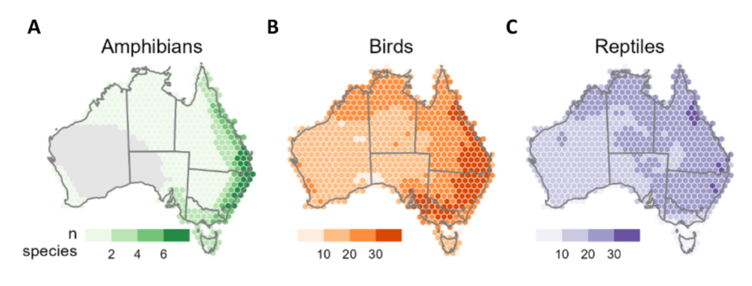
Distribution of Native Species in the Australian Pet Trade by Taxonomic Class. These hexagonal maps represent the distribution of traded native species across Australia, aggregated to 120 km² hexagons. Color gradients indicate species richness per region, offering a clear visualization of the region biodiversity in the Australian pet trade.
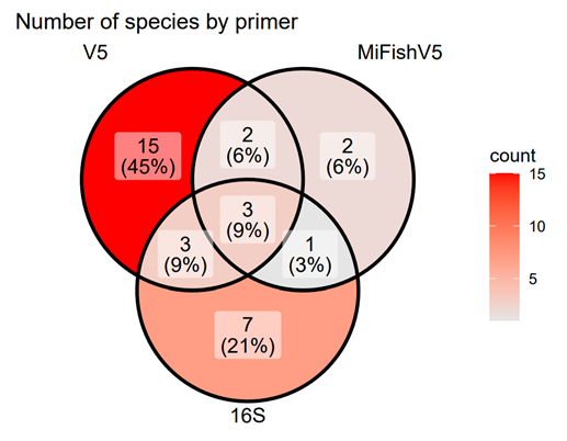
Species Detection by Primer: Venn Diagram of Overlap. This Venn diagram visualizes the overlap in species detected by three different primer sets.