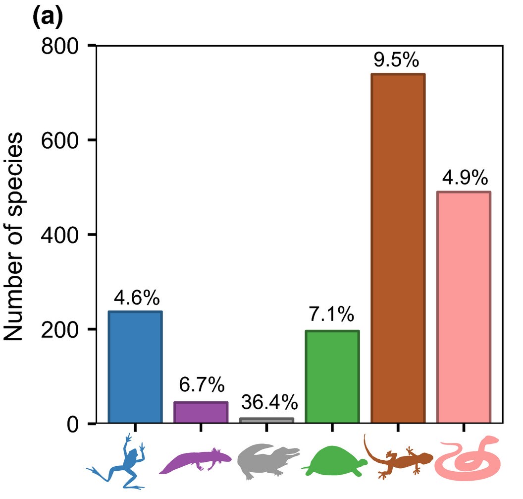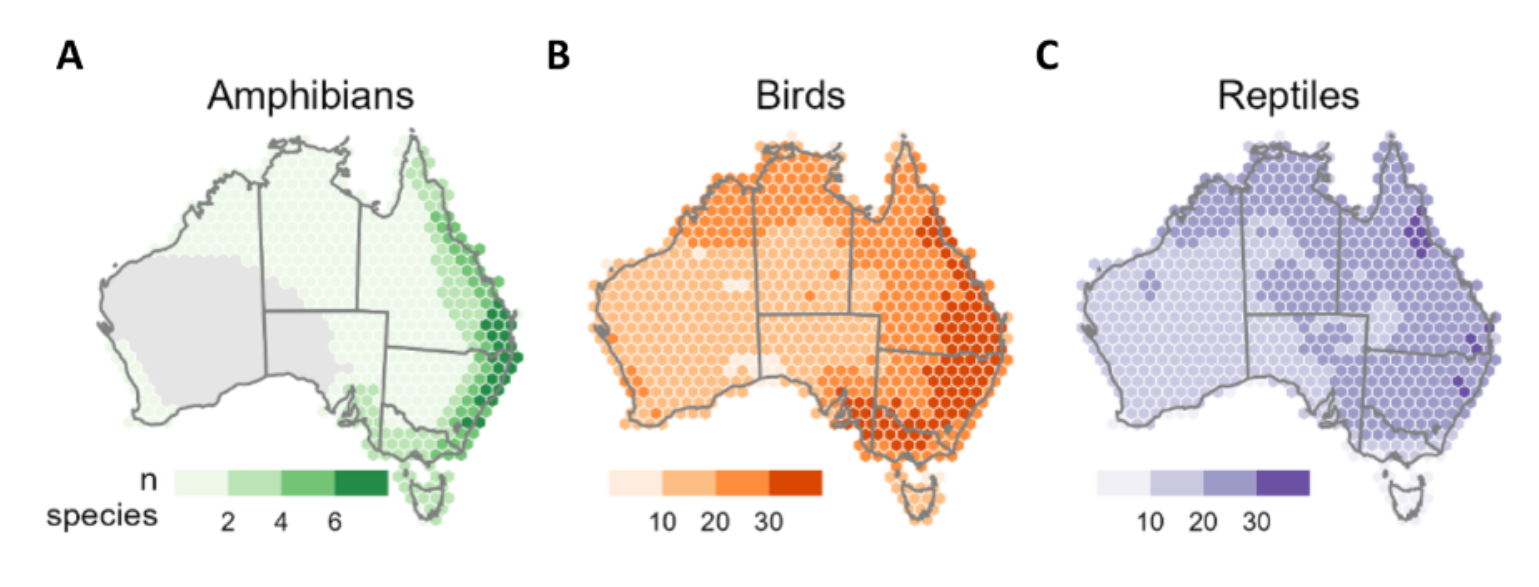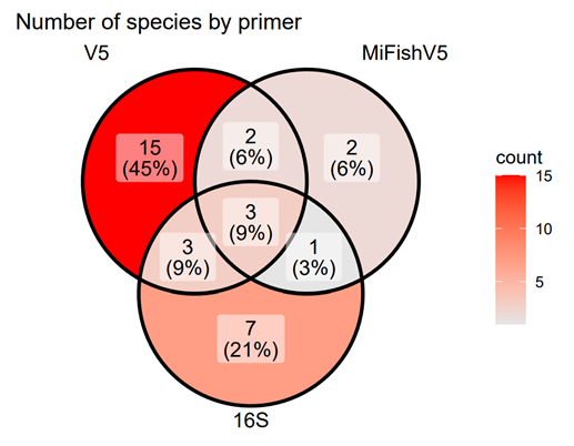

RCEI’s Research Analyst specializes in creating data visualizations and diagrams that effectively communicate detailed information and highlight key findings, enhancing storytelling in grant applications. Their primary focus is translating complex data into visually engaging and informative formats. Below are examples of visualizations they have produced.
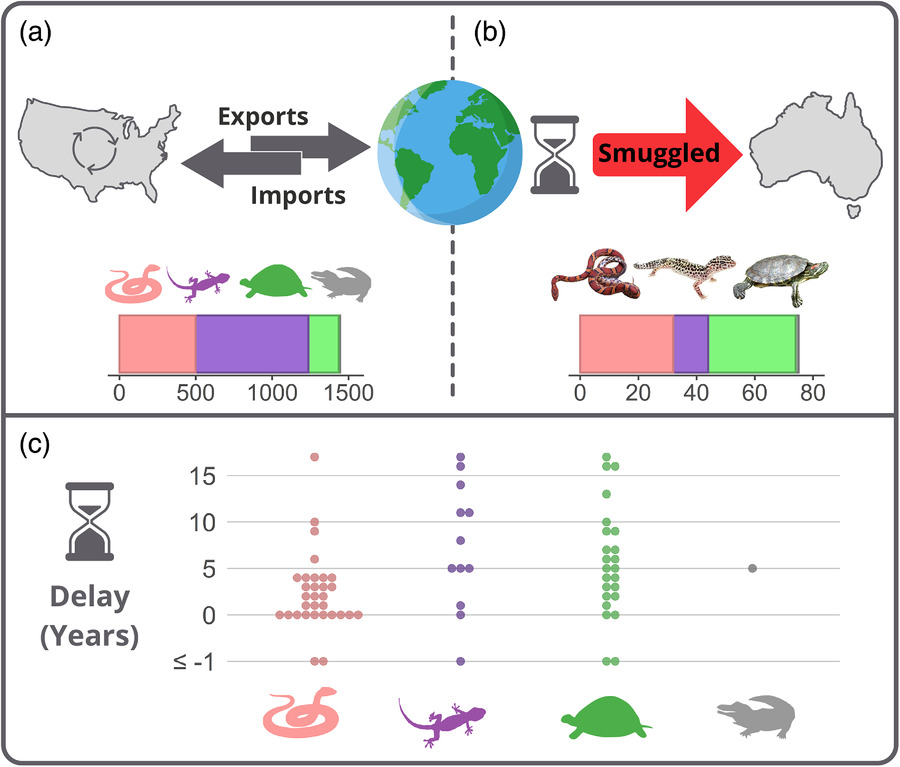
Trade and Smuggling of Reptiles: A Global Perspective. This diagram provides a comprehensive visualization of reptile trade and smuggling dynamics between the U.S. and other global regions, with a particular focus on smuggling routes into Australia.
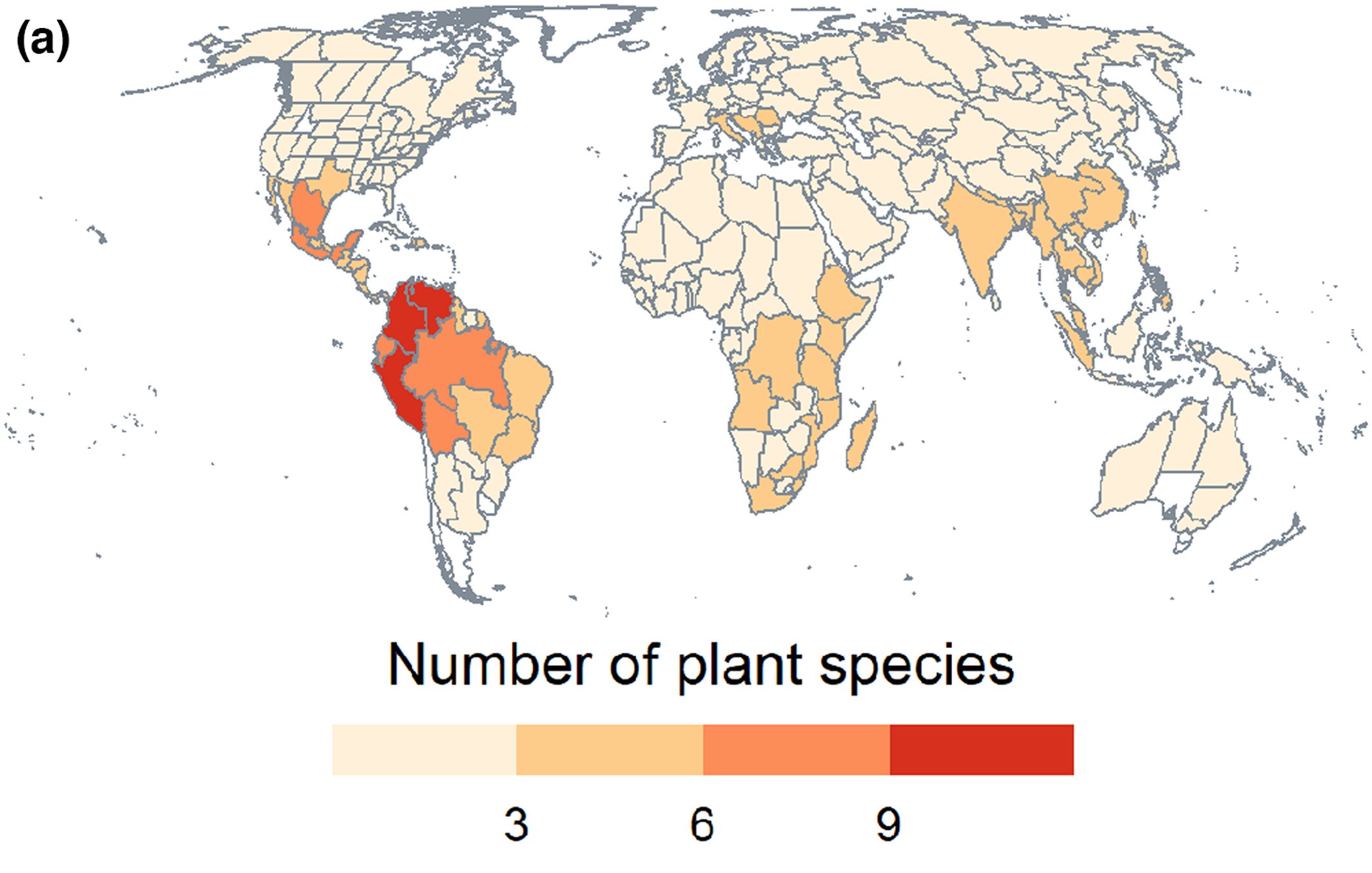
Global Distribution of Plant Species Traded on the Dark Web. This world map visualization presents the native distribution of plant species involved in dark web trade.
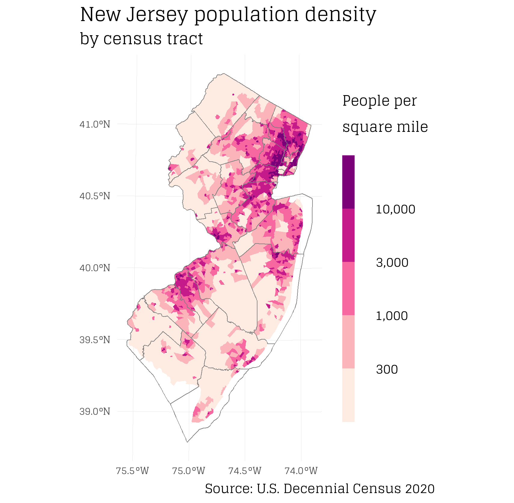
New Jersey Population Density by Census Tract. This choropleth map visualizes population density across New Jersey, measured by people per square mile, according to the 2020 U.S. Decennial Census. The color gradient clearly delineates high-density areas, with darker shades representing more populous regions.
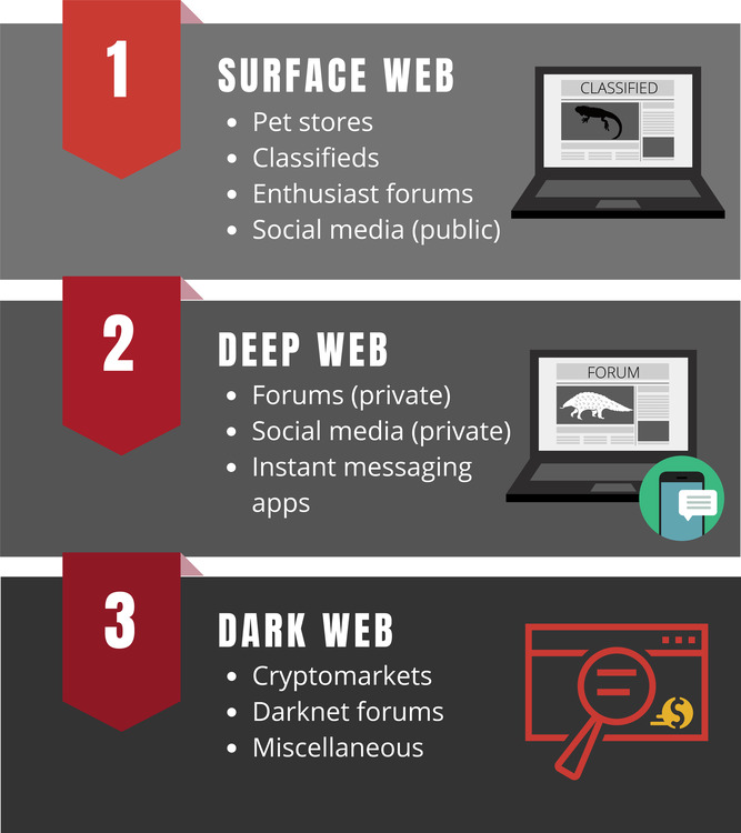
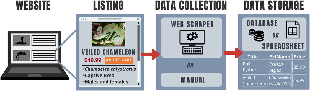
The Three Layers of Wildlife Trade on the Internet. This diagram categorizes the different levels of the internet where wildlife trade occurs. Each section highlights the types of platforms used for trading, from public pet stores and classifieds to cryptomarkets and private forums.